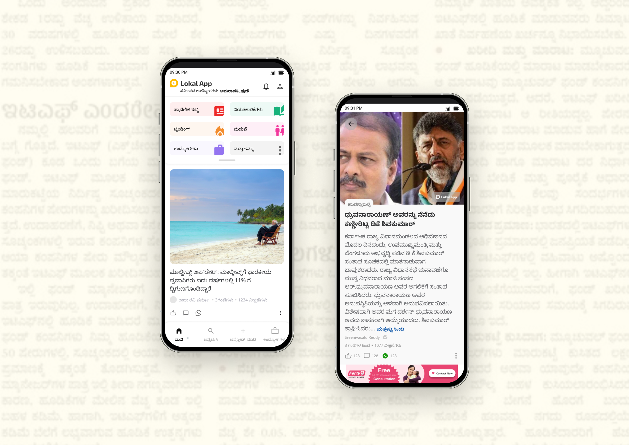
Transforming news experience for bharat users— with enhanced reading, deeper discovery and higher consumption.
Lokalapp is all in one platform that enables tier 2 plus Bharat users with their daily needs starting from consuming news about their local area to finding a Job
Image - Photo from QA testing
Problem space
Understanding the triggers
The month of July as a platform we saw huge uplift in DAU tp 1644902, but the data from August , September and October saw a sharp fall in DAU., MAU and even on views per DAU. This was concerning for us given these are our key metrics that had hit all time low for the year.: This demanded the following two things
Root cause analysis to understand the fall in metrics
Better understanding of user needs
Image - Distribution of average MoM MAU on Lokalapp
Image - Distribution of DAU from swipe to QAM funnel
This led to identification that
“User were dropping off post swipe feed”
Understanding the existing experience
Inferences
“Decision paralysis for user to choose between various feeds and elements.”
“Text heavy UI - thereby forcing the user to read and find out more than to scan”
key performance indicators of Lokal news ( growth levers )
Looking at the funnels
On data analysis we have an understanding that the views for news have been segregated into various feeds with various users going to different feeds ( decision paralysis - to consume news from which feed ) based on their behavior and we as a platform don’t have a fixed direction to scale and analyse user data of news so as to target users better.
Looking at consumption funnel we see a huge drop from user coming to swipe feed to homepage feed. This points at discoverability of other categories and various engagement levers reduces significantly.
“Users not interacting with other features”
“Lack of flexibility for user to choose or customize”
“Lack of consistency of text styles and visuals”
“Users have too many options to choose from”
“Lack of visual hierarchy of information”
“Distracting Ads - preventing user from natural flow”
Our users
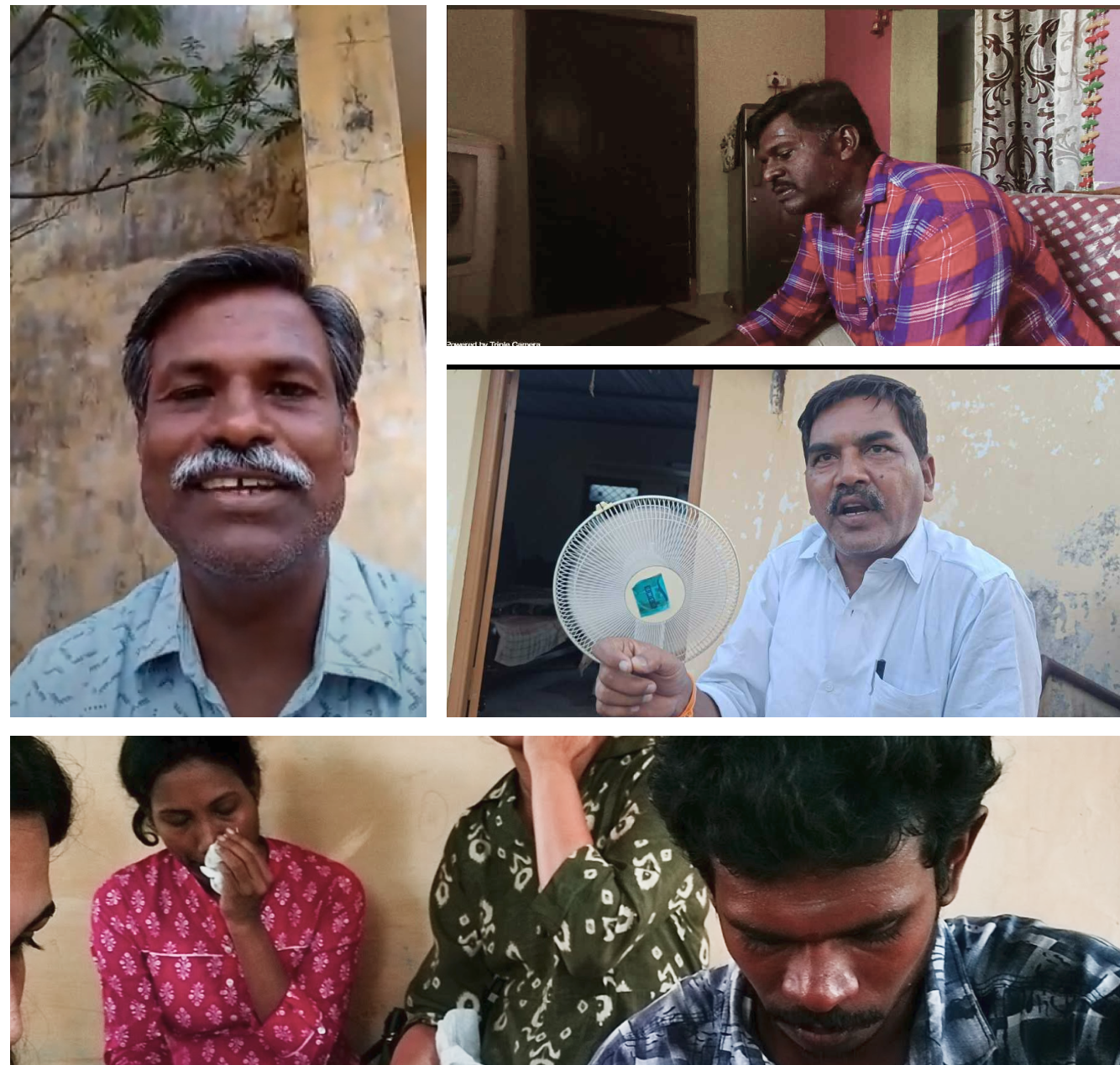
In efforts of first hand understanding of what was happening, we made trips to Tamil Nadu and Andhra Pradesh to understand users in their context and the problems they were facing
Team - CEO Jani Pasha, Content manager - Priya Prasanth, Market Insights - Priyanka Samanta , Product Designer - Sandeep, Avinash, Product Manager - Sania , Sai Ganesh
What our users had to say ?
நான் காலையில் எழுந்து, அறிவிப்புகளைப் பார்க்கிறேன் மற்றும் செய்திகளைப் படிக்க முயற்சிக்கிறேன், ஆனால் பிரேக்கிங் அல்லது உள்ளூர் செய்திகளைப் புரிந்து கொள்ள முடியவில்லை. அரசியல் மற்றும் குற்றச் செய்திகள் மட்டுமே உள்ளன, எனவே நான் கைவிடுகிறேன்.
"I wake up in the morning, check notifications and try to read the news, but can't understand breaking or local news. Only politics and crime news, so I give up"
నేను పని తర్వాత ఖాళీగా ఉన్నప్పుడల్లా వార్తలు చూస్తాను, కానీ నాకు వార్తలు మాత్రమే నచ్చవు, అది చాలా విచారకరం.
Understanding the user
.Users interact with the first 5 to 7 stories, then they decide if they want to be on the platform or leave the app.
Good pictures and catchy headlines make users interested in the news.
Users loose interest in content, after they either don’t get what they are looking for or find stale or repeated news.
Power users want flexibility to scan and have particular news types choices like crime , sports , politics
Users are not exploratory and ignore anything that is difficult to figure out on first few interactions
My Inferences?
Image - Lokalapp users from Tamil Nadu and Andhra Pradesh
"I see news whenever I am free after work, but I don't like only news , its too sad."
தல மற்றும் ஜோதிஷ் பற்றிய செய்திகளைப் பார்க்க விரும்புகிறேன், ஆனால் உள்ளூர் எனது பிராந்தியத்தைப் பற்றிய செய்திகளை மட்டுமே தருகிறது, இது எனக்கு முன்பே தெரியும்.
"I want to see news about Thala and Jyotish , but Lokal only provide news about my region which, I already know."
Insights to work upon
Enabling users to engage more with the platform thereby retaining them
Enabling better discovery of various type of stories for the users.
Adding value to user thereby retaining them on platform
The Bigger picture
Holistically most metrics were going down at a considerable rate pointings towards an overall dissatisfaction with the product hence an overhaul was needed to increase customer satisfaction.
How might we enhance discovery
Discovery being the first step is essential for better engagement and to make sure that user stays on the platform for more time period.
How might we ensure user retention
By focusing on improving discoverability and creating a stellar first impression, users are more likely to engage with the product. Moreover, delivering valuable content will help in retaining users on the platform for an extended period.
User Satisfaction Loop
How might we enhance user engagement
Engaging user on the visceral level is very important to increase user satisfaction. As a social news product the first few instances of user interaction will play a major role in ensuring an ever lasting effect with the product both in terms of value deliverables and visual appeal.
Iterations and experiments
Out of the brainstorming ideas , on discussion with product certain ideas were prioritized which would solve the users immediate needs and would bring impact.
Discovery Experiments
Engagement Experiments
Retention Experiments
Design Decisions
The user flow
Keeping the flow simple and identifying user interaction points we made sure that the customer / user satisfaction can be ensured
Design Considerations
To ensure better discovery, engagement and retention, the major touch points are
Swipe feed where users land directly,
Homepage - where user comes with less intent on clicking back
Notifications - if they find something interesting they would interact
High Intent touch points
Swipe card designs have the highest intent to interact with for the user hence they were broken down into major 5 functionalities
Trust markers - Creating and bonding relations with user
News - Information heavy
Relaxation - Entertainment , Edutainment
Monetisation - Ads , advertorials
Flexibility of customization
Designs for Trust markers & News
Designs for Relaxation
Designs for Monetisation
Average Intent touch points
Home feed has the second highest intent of the user to interact with but their interst drops once they leave swipe feed. AT this junction we will try and focus on
Cross sale of other features on platform
Attention to content
User Interaction - engagement
Exploratory nature of the user
Designs to catch user attention for easy discovery and engagement on first fold
Designs below fold for user engagement and retention
Low Intent touch points
The lowest intent for a user is at the notification panel and user consume only when they come across something interesting or about a preconceived news that they want to explore, hence we focus on
Increasing discoverability
Understanding of type of content
Exploratory nature of the user
Designs for notifications
Testiing
Based on various design iterations, user testing was done for each feature separately and A/B tests were run to arrive at the above designs , these are few learnings
One font style doesn’t work for vernac languages - hence new font styles need to be introduced
Users are directed by better quality and larger image size , making content king rather than any other engagement factor
Users mostly consume “what I see mindset” , but they also like the flexibility to consume via exploration
Users interact with Ads if they are interesting , thereby increasing Ads revenue
Users are more keen on consuming and sharing information thereby providing a feeling of satisfaction
Tracking the metrics
Based on the release and scaling up over a period of 3 months these are the data from December review
Impact of metrics
The success of a better feed made the company release two separate apps Lokal app lite on IOS and And android with only the undivided swipe experience
Challenges faced
The major challenges that I faced as a designer on this project are
understanding various user needs and preferences , that kept changing from state to state
As these are very iterative designs , convincing stakeholders to a common design without any bias is tough
Lokal app not built on react hence quick iterations are tough and challenging
Design that were created in english fonts looked very different with respect to proportion and hierarchy when converted to vernacular language
Understanding Bharat users and their technological know how w.r.t android devices is base to create good experiences
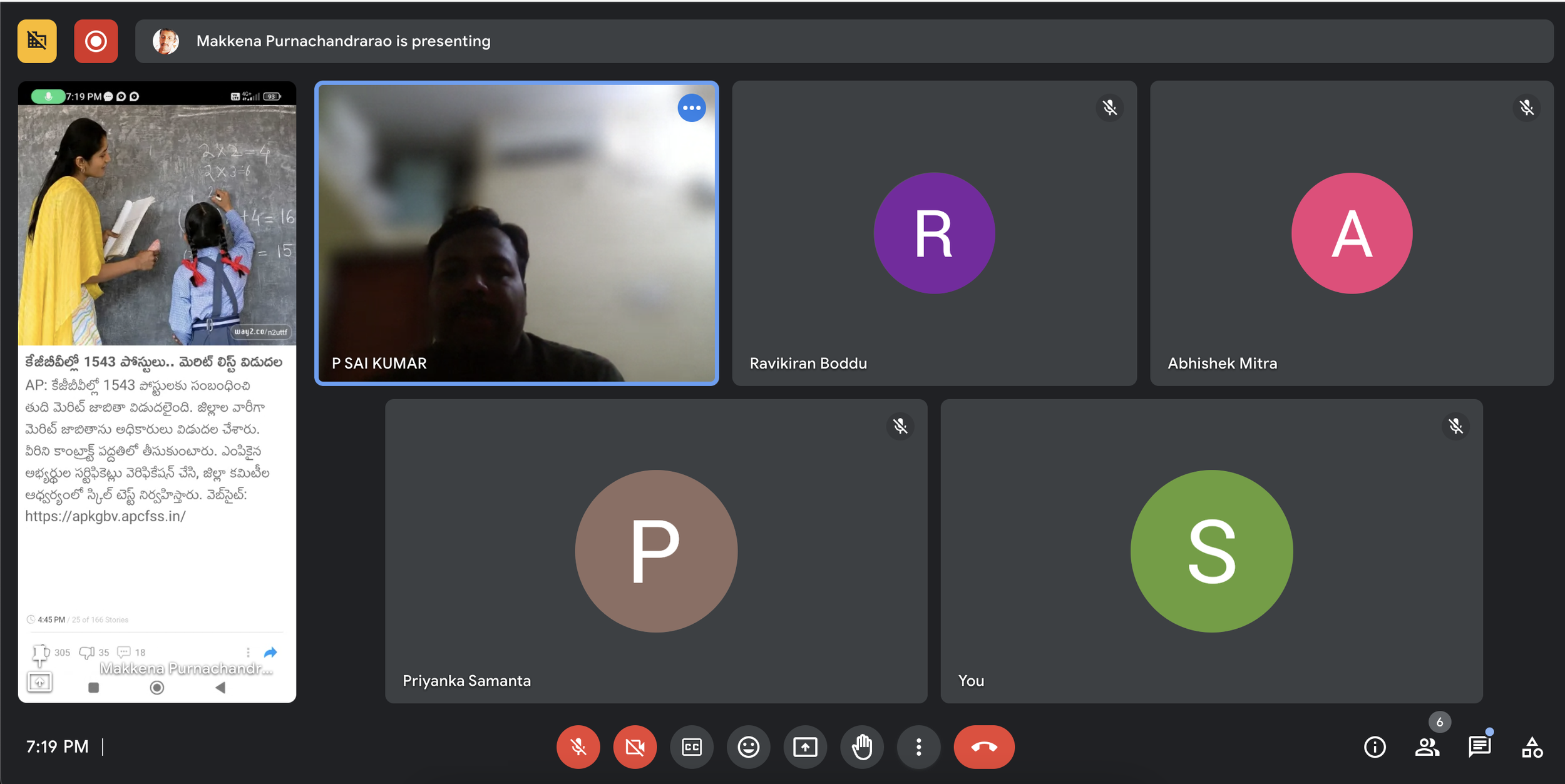
Image - Sessions with stakeholder for feedback and betterment
Way forward
Further iterations are still on to optimise these numbers based on ever changing user preference and events.
Post November mid I had shifted to Monetisation pod and worked closely with recruiter and seekers to improve their hiring and job hunting experience. Feel free to check out that project too.


